This method of data analysis all starts with how I organize
the tests I use in my classroom. I always organize my tests by subtopics. For
example, on a scientific method test I have headings like hypotheses,
variables, and qualitative/quantitative observations. All of the questions
pertaining to hypotheses will be found under that heading. This way, my
students and I are able to quickly look at a section and see how well they
understood it.
Take a look at my beginning/end of the year exam. You’ll
notice the categories are all clearly laid out on the answer sheet. If you look
at the picture of a page from the test, you’ll see the organization of the
heading and questions. Having an organized test helps make data analysis much
quicker.
After the students take the test and I grade their work, I
dedicate about forty-five minutes of class time to analyze results with my
students. This seems like a lot of time to look at data, but it gets the
students motivated to do better. It shows them their growth and helps them
reflect upon their study habits and become better future learners. It also
shows the students who didn’t perform well on the test that they still have a
good understanding in some areas (which helps prevent feeling like a failure,
shutting down, and “not caring”). Also, during that forty-five minutes the
students get needed practice with graphing and finding patterns in the results.
What do I do during that forty-five minutes? I start by
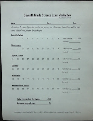
having the students complete side one of a reflection sheet. (See the picture below.) Side one lists the topics covered in the test and shows each question
number in each topic. For example, the Measurement questions on the test were
numbers 11-20, so all of those numbers are listed under the Measurement
heading.
Side one of the reflection sheet has students circle the
question numbers they get correct and find the total number of questions correct
for each topic. Then they calculate their percent correct on each topic. My
students always need reminders of how to calculate percent, and I usually let
them use the calculator on their phones for this.
Once side one of the reflection is completed, it’s time to
determine best topics and most challenging topics. Side two of the reflection
sheet helps with this. Side two has students consider their best and most
challenging topics and try to determine the reasoning behind their success or
misunderstanding.
Before class, I set up a poster or a
group of papers with the test topics listed out. I sometimes divide each paper
by class period or have separate posters for each class. Other times, I have
all of the classes put their stickers on the same poster.
Now it’s sticker time! I give all of the
students two different colored stickers. You’ll need a lot of stickers for this
so I buy some basic dot stickers to save money. This pack of 315 stickers costs
about a dollar. I need two packs for my 200 students because I use only the
blue and the red. Foil stars work well for this, too.
The blue stickers represent each individual student’s best
topic. The red stickers represent his or her most challenging topic. Inevitably,
I have students who have multiple best or worst topics. For those students, I
tell them to select the topic that came easiest for them (for the blue sticker)
or the topic that just never made sense to them (for the red sticker). The
students who excelled on the test are still given a blue and a red sticker. The
only exception I make to a student using both stickers is if the student feels
very strongly that he or she had no challenging topic; then that student can
just use a blue sticker on a favorite topic. Alternatively, you can have an
additional topic on your poster that says “All” for students who aced the test.
Students aren’t allowed to choose “All” for their red sticker because it feels
too negative; there is always a topic that’s better than others.
After all of the stickers have been placed on the posters,
we can quickly determine which topic is better than the others and which topic
looks bloody. You can easily see on the posters below that the best topics are the Scientific Method and the Human Body. At a glance, you can tell the most challenging topics are measurement and either Genetics or Physical Science.
We tally up the number of blue stickers and the number of red
stickers for each topic. Then the students make a bar graph of the class’s results.
We have a thorough discussion of possible reasons for the strengths of certain
topics. (Potential reasons for success could be more time spent on that topic,
a project or experiment that helped with understanding, or the level of
interest students had.) We also discuss the likely reasons for the red topic.
(Possible reasons could be difficult subject matter, more math involved, or
many students being absent during that topic for weather or sports reasons.)
I like this method of data analysis because it is more
student-centered. It’s not very time consuming for me. I don’t have to do much
to analyze the data other than organize my tests a certain way and make some
quick posters. Showing the results of tests using stickers makes it very easy
for students to see their results and the results of the class. It gives them
and me instant feedback that we can use to increase the understanding of content.
If you have any questions about how to use this in your class, please comment below or send me a message using the Contact Me tab of my blog. My seventh grade science exam includes the reflection sheets seen on this blog and can be purchased at my Teachers Pay Teachers store.


